Bootbox.js is a small JavaScript library which allows you to create simple programmatic dialog boxes using Twitter's Bootstrap modals.
Dialogs using Twitter Bootstrap
You may be wondering why a few wrapper methods around bootstrap's built-in dialog capabilities are either necessary or desirable. To begin to answer that, let's look at the code required to show a simple alert style dialog programatically using bootstrap:
<!-- set up the modal to start hidden and fade in and out -->
<div id="myModal" class="modal hide fade">
    <!-- dialog contents -->
    <div class="modal-body">
        Hello world!
    </div>
    <!-- dialog buttons -->
    <div class="modal-footer">
        <a href="#" class="btn primary">OK</a>
    </div>
</div>
// ensure modal is only shown on page load
$(function() {
// wire up the buttons to dismiss the modal when shown
$("#myModal").bind("show", function() {
$("#myModal a.btn").click(function(e) {
// do something based on which button was clicked
// we just log the contents of the link element for demo purposes
console.log("button pressed: "+$(this).html());
// hide the dialog box
$("#myModal").modal('hide');
});
});
// remove the event listeners when the dialog is hidden
$("#myModal").bind("hide", function() {
// remove event listeners on the buttons
$("#myModal a.btn").unbind();
});
// finally, wire up the actual modal functionality and show the dialog
$("#myModal").modal({
"backdrop" : "static",
"keyboard" : true,
"show" : true // this parameter ensures the modal is shown immediately
});
});Note that this example is purely for demonstration purposes - you probably don't want to show an obtrusive dialog as soon as the page loads! Nevertheless, as you can see from the previous snippet, we have to:
- Create the dialog's HTML and have it present somewhere in the DOM
- Add the buttons to dismiss the dialog
- Wire up the JavaScript handlers for each button present in the dialog
- Ensure the handlers are unbound when the dialog is hidden
- Show and hide the dialog itself
It's important to stress that none of these points are negative, nor are they particularly arduous. However, when you want lots of dialogs and you don't want to create all of the HTML and JavaScript for each one, it can get a bit unwieldy. This is where bootbox comes in.
Bootbox.js Alerts
Let's dive straight in and see the most simple example of a bootbox alert in action:
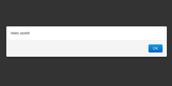
bootbox.alert("Hello world!"); Which results in the following dialog, which was shown above.
So far, so simple - you've got the same result for a fraction of the code. Additionally, bootbox tries to mimic the behaviour of JavaScript's built-in alert as best as possible, hence the 'OK' button is automatically focused so the user can dismiss it by hitting the return key. This brief example demonstrates how bootbox simplifies creating, showing and dismissing bootstrap's dialogs, so let's now go on and look at what else it can do.
Alert Callbacks
The typical use case for an alert dialog is to present the user with a blocking notification which they have to acknowledge before continuing - crucially in JavaScript this translates into literally blocking the script's execution when using alert or confirm, meaning that as a developer you can guarantee that the alert has been dismissed before subsequent code executes. In userland, you can’t block the script's thread of execution, so we have to resort to a familiar ally if we want to delay execution of some code until we're sure a user has processed our notification. This ally comes in the form of a callback function provided as an argument to our bootbox alert method. Let’s take a look at an example:
bootbox.alert("Hello World!", function() {
    // any code you want to happen after the alert is dismissed
    console.log("Alert dismissed");
});
This means the bootbox API isn’t like-for-like with the native JavaScript methods it mimics, but it's a suitable alternative and one which provides a very familiar interface to JavaScript developers. Besides, the way the native methods block everything isn't particularly pleasant anyway.
Custom button labels
Last but not least on the subject of alert boxes, you can provide a custom label if you’re not happy with the standard ’OK’ button:
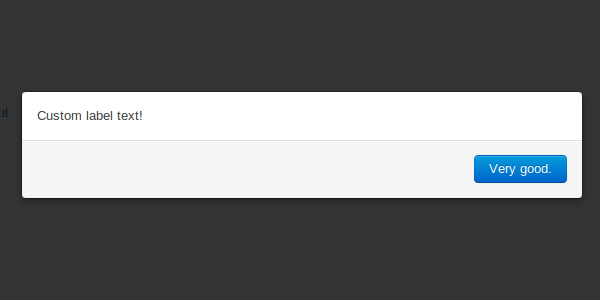
bootbox.alert("Custom label text!", "Very good."); Resulting in the following button being displayed:
As you can see, the argument list is flexible - the general rule of thumb is that a callback method, if provided, should always be the last argument.
Confirm dialogs
The native confirm method is as useful — and in some cases certainly more useful — than the alert method, as it not only alerts the user but prompts them to make a meaningful decision which will impact subsequent program flow based on their choice. Let's take a look at its most basic usage:
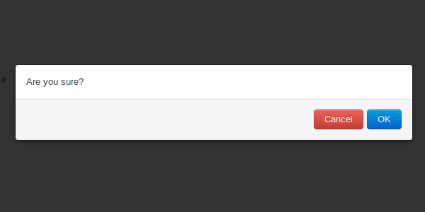
bootbox.confirm("Are you sure?"); A confirm without a callback isn't particularly useful, but since it’s entirely possible using the native method, it’s possible with bootbox.
Confirm callbacks
Let’s look at getting the most out of of the choices we offer the user. The callback we provide will be populated with a boolean representing which choice the user made as per the native method:
bootbox.confirm("Are you sure?", function(result) {
    if (result) {
        console.log("User confirmed dialog");
    } else {
        console.log("User declined dialog");
    }
});
The API provided follows the same format of bootbox.alert, which means we can override one or both of the button labels we show the user if we want to:
bootbox.confirm("Are you sure?", "No way!", "Yes, definitely!", function(result) {
    console.log("Confirmed? "+result);
 });
Custom dialogs
Under the hood, bootbox.alert and bootbox.confirm just process the arguments provided to them and ship them off to bootbox.dialog which is a public method which you can call too. It takes a range of flexible arguments which allow the creation of complex dialogs with a variety of buttons and callbacks. Of course, you can create very simple dialogs too, and although you’re probably better off using bootbox.alert to do so let’s take a look at the most simple dialog we can create:
bootbox.dialog("Hello there!"); The above snippet isn't very useful since it provides no buttons, meaning the user can't actually respond to the dialog at all. Let's sort that out, and while we're at it, let's add a callback function (though the callback key is entirely optional):
bootbox.dialog("Hi there!", {
    "label": "OK",
    "callback": function() {
        console.log("callback");
    }
});
For convenience, the following form is equivalent if you want to provide a label and a callback without a custom button class:
bootbox.dialog("Hi there!", {
    "OK": function() {
        console.log("callback");
    }
});
What's this about button classes? So far we haven't provided any at all, which causes bootbox to do some head scratching to work out the most appropriate classes to apply to each button (e.g. primary on a single button, danger and primary for two buttons). We can provide a class key to customise the appearance of our button labels as per the classes provided by twitter's bootstrap framework:
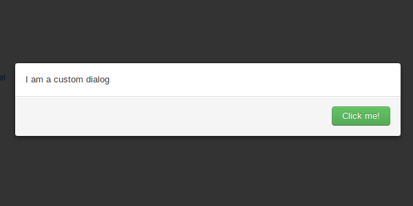
bootbox.dialog("I am a custom dialog", {
    "label" : "Click me!",
    "class" : "success",   // or primary, or danger, or nothing at all
    "callback": function() {
        console.log("great success");
    }
});
Multiple buttons
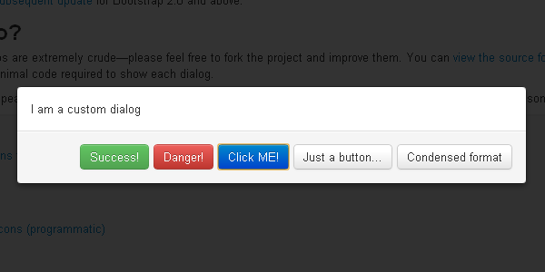
So far, we've only looked at a custom dialog with one button displayed to the user. However, if you're using bootbox.dialog in the first place, you probably want more than this. Let's have a look at a significantly more complex dialog:
bootbox.dialog("Plenty of buttons...", [{
    "label" : "Success!",
    "class" : "success",
    "callback": function() {
        console.log("great success");
    }
}, {
    "label" : "Danger!",
    "class" : "danger",
    "callback": function() {
        console.log("uh oh, look out!");
    }
}, {
    "label" : "Click ME!",
    "class" : "primary",
    "callback": function() {
        console.log("Primary button");
    }
}, {
    "label" : "Just a button..."
}, {
    "Condensed format": function() {
        console.log("condensed");
    }
}]);
Please note the subtle difference in the method's arguments - the second of which is now an array of objects, rather than just a single button declaration.
Other options
We can specify a third argument to the dialog method which closely resembles the options accepted by bootstrap's $.modal method:
bootbox.dialog("Plenty of buttons...", [{
    "label" : "A button",
    "class" : "success",
    "callback": function() {
        console.log("great success");
    }
}, {
    "label" : "Another button...",
}], {
    "backdrop" : "static",
    "keyboard" : false,
    "show"     : true
});
In fact, the only difference is that you can provide an onEscape option, which is a callback to be executed when the user dismisses the dialog with the escape key:
bootbox.dialog("My Dialog", {
    "A Button": function() {
        console.log("dialog dismissed by button");
    }
}, {
    "onEscape": function() {
        console.log("dialog dismissed by escape key");
    }
});
Internally, the onEscape option is used when calling bootbox.alert meaning that a user can dismiss an alert message by pressing escape. Since confirm dialogs require a decision, the escape key is disabled when calling bootbox.confirm. Of course, with bootbox.dialog you can use onEscape however you wish - you can disable it, you can pass it the same callback as one you provide to one of its buttons, or you can give it an entirely customised callback. The choice is yours.
Hiding dialogs
By and large, you'll want your user to determine when it's time to hide a dialog by choosing one of its options. However, there may be times when you need to programatically do this. So far we haven't been interested in the return values of any of the bootbox methods, which is always the DOM element created representing the modal dialog box. If you assign this return value to a variable then you can hide it using twitter's $.modal('hide') method:
var box = bootbox.alert("This dialog will disappear in three seconds.");

setTimeout(function() {
    // be careful not to call box.hide() here, which will invoke jQuery's hide method
    box.modal('hide');
}, 3000);
An alternative use case is when you want to hide all active instances of bootbox dialogs. Although you shouldn't really have more than one dialog on screen at once, if you do (or if you don't want to keep track of your dialogs using variables), then bootbox has a convenience method to hide all of its dialogs at once:
bootbox.alert("Hello");
bootbox.confirm("Can you take it?");
bootbox.alert("Boo!");

setTimeout(function() {
    // that's enough of that
    bootbox.hideAll();
}, 3000);
One final note on hiding dialogs in this manner - please note that none of your callbacks, either assigned to a button selection or the escape key, will be triggered when dialogs are programatically hidden.
Bootbox requirements
Bootbox naturally requires on twitter's bootstrap CSS, and the modals require the bootstrap-modal.js JavaScript too. Additionally, since Twitter's Bootstrap JavaScript plugins require jQuery or Ender, so does bootbox (to be honest, it has only been tested thus far with jQuery).
Bootbox is quite easy to use, and features some important customization options:
- onEscape and animate functions;
- Support for multiple subsequent dialogs;
- Support for dynamic content;
- and so on.

