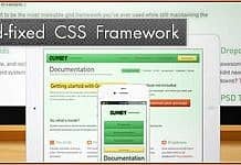
Not Just a Grid is a flexible and modular css framework that is designed to assist in the rapid prototyping and development of websites. It has been designed for the future with larger screen sizes and the use of CSS3 for progressive enhancement and richer user experiences.
The author - Al Redpath - started to develop this framework that became Not Just a Grid out of personal need. He had used a number of different frameworks, added to them and combined various elements to create a base framework that Al’s used to develop many websites. However this led to a bit of a mish mash of class names and a lot of redundant or duplicated code, so in late 2010 he decided to go back to square one and create a new framework from the ground up that would be the basis of all future sites.
Main concepts are:
- A grid system that would allow for 1,2,3,4,5 & 6 columns (some existing grids can't de divided into 3 or 5 or 6 without adding additional classes)
- The ability to take advantage of higher resolution screens without being fluid or elastic
- A consistent set of common elements that could be quickly and easily tweaked
- A good typographic base from which to build on, rather than reinventing the wheel every time
- Must be modular - use as few or as many parts as needed.
- The grid must be lightweight (the grid is 15 classes and 1k in size)


